Whole Foods on Prime Now Redesign
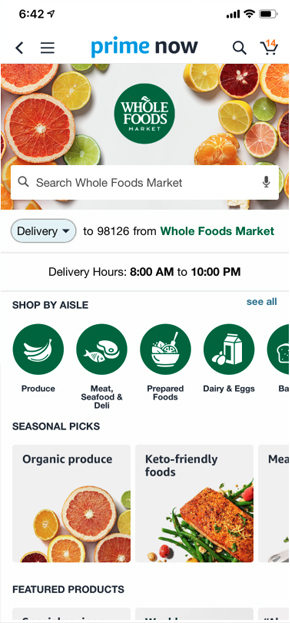
When asking active Prime account users to shop for their groceries on PrimeNow, all users immediately identified and clicked a store they desired to shop in and began searching for products they wanted through the search bar. 7 out of 10 customers noticed that the store results changed from their specific store to all stores and comments such as, “Wait, why am I seeing all these stores? I thought I just wanted Whole Foods,” and “Oh, did I accidentally search for all instead?” Changing the store experience when going through search causes confusion for the customer.
There are two main scenarios that can happen as a result of this:
- The customer doesn’t realize that they’ve exited Whole Foods Market store and adds the Halos from Amazon. When they go to their cart, they’re confused as to why the item isn’t showing in their Whole Foods Market cart.
- The customer sees that Whole Foods Market options are on the bottom half of the page and proceeds to scroll, looking for Halo oranges, and may potentially not find them.
The solution of defaulting the search within their previously selected store, offers a more coherent shopping experience for building a basket. Populating alternative store experiences underneath their search provides the customer with greater visibility and gives the customer more control over their shopping experience. Additionally, adding store logos for every item up to checkout further provides customers the knowledge and therefore confidence needed to easily make a purchase.
See the proposed solution.


